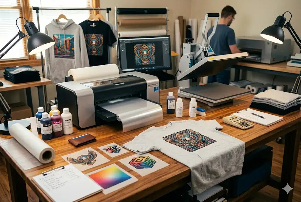
Direct-to-Film printing has quickly become one of the most reliable and versatile design methods in the custom apparel industry. DTF provides businesses and creators with an effective printing solution for cotton, polyester, fabric blends, and dark materials, whereas other printing methods have limitations. However, dTF may not work well if you don't do it right.
The quality of DTF transfers relies on two factors that create and maintain vibrant colors throughout the printing method. Each process, which starts with artwork creation and ends with final curing, determines how bold your design will appear after pressing it onto fabric.
In this DTF vibrant colors guide, we’ll break down how to increase DTF print vibrancy in three simple, actionable steps you can apply immediately to improve your results.
Step 1: Start with High-Quality Artwork and Proper Color Setup
High-Quality Artwork and Resolution
- The process of creating a vibrant film starts with your artwork file.
- The most frequent reason for DTF printing to appear flat is when users provide low-resolution images with incorrect color and poor contrast settings.
- The design process requires designers to work with 300 DPI while using high-resolution files to maintain their visual detail and sharpness.
Proper Color Mode and Profile Setup
- You need to pay equal attention to both aspects of color mode selection to increase DTF transfer color brightness. Designers create their work in RGB format, but DTF printers require RIP software and ICC profiles to accurately interpret the color output from their designs.
- The correct color profile implementation ensures that your printing process produces accurate results for bright reds, deep blues, and rich blacks.
- The absence of effective color management results in two printing problems, which include prints that show excessive brightness and prints that show excessive darkness.
Contrast and Color Application Techniques
To make DTF prints more vibrant, always increase contrast at minimal levels while using solid color fills to achieve better results than using gradients with low opacity.
Additionally, your printer needs clean edges and strong color foundations so it can create vibrant ink layers that maintain their saturation throughout the printing process.
Step 2: Optimize Ink Layers, Film Quality, and Adhesive Application
Ink Application and White Underbase
After the artwork reaches its final stage, the second most important factor determining the design's brightness is the method artists use to apply ink to the film surface. DTF printing uses a process in which artists apply CMYK ink first, followed by a white base layer. The white layer acts as a foundation, allowing colors to pop, especially on dark garments. If the white underbase is too thin, colors will look muted. If the base shows irregular thickness, the colors will display changing degrees of brightness.
Film Quality and Print Clarity
Apart from DTF transfer brightness settings, premium PET film allows for better ink absorption while enabling smoother ink release during the pressing process. Low-grade film results in ink spread, which leads to a decrease in both clarity and brightness.
Adhesive Powder Distribution and Curing Accuracy
Adhesive powder needs to achieve complete distribution while it reaches its necessary drying stage. The distribution of powder leads to uneven results, creating a dull appearance, a rough texture, and weak bonding. The adhesive requires a specific melting temperature to enable clean bonding while preventing excessive heating of the ink, which can cause color changes. The current step requires accuracy to preserve the original brightness of your artwork.
Step 3: Control Heat Press Settings and Fabric Selection
Proper Heat Press Temperature and Pressure
Even the most perfectly printed transfer will lose its vibrant colors when it gets pressed through the wrong method without the best settings for vibrant DTF prints. The temperature and pressure need to match the time requirements that manufacturers have established. Excessive heat will result in ink damage because it makes colors less bright. Insufficient pressure will result in incomplete adhesion, which causes the materials to fade and crack after washing.
Adhesive Activation and Second Press Technique
The adhesive requires medium-to-firm pressure because it needs that pressure to achieve full activation, which allows it to bond with the fibers. The first press brings good results, but the second press with parchment paper produces better color richness and smoothness enhancements.
Fabric Selection and Print Performance
The choice of fabric establishes important requirements for performance. Textured materials and rough fabrics produce less vibrant color results than smooth, tightly woven garments. Bold results emerge from cotton and cotton blends, whereas synthetic fabrics create brightness changes because of their reflective properties.
Conclusion
The vibrant colors of DTF printing emerge through deliberate design methods, which include correct ink application methods and accurate temperature control. The printing process requires you to use high-resolution artwork together with white underbases and premium film and proper press settings to create bold, professional results. The process needs consistent execution to produce dependable results to appeal to customers.
Want to increase DTF print vibrancy? Check out our DTF Sample Pack and DTF Color Chart and start making collections today!
FAQs
1. Why do DTF prints sometimes look dull?
The dullness of DTF prints results from three main factors: low-resolution artwork, incorrect color profiles, and low-strength white underbase. The combination of proper artwork configuration, effective white ink application, and precise heat-press operation can resolve this problem. DTF transfer brightness settings
2. How does fabric type affect DTF print vibrancy?
Fabric type plays a major role in DTF transfer color optimization and how vibrant a DTF print appears. Smooth, tightly woven fabrics create better light reflection, which makes colors appear brighter.. Cotton and blends typically deliver bold results, while certain synthetic materials exhibit minor intensity changes due to their reflective properties.
3. What role does the white underbase play in print brightness?
The white underbase provides a base layer that enables CMYK inks to adhere in DTF printing. Dark garments require a strong white layer and the best inks for vibrant DTF prints, which allow colors to show their full brightness. The correct underbase thickness enables consistent color reproduction, which maintains fabric color accuracy across various fabric materials.
4. How does curing affect DTF transfers?
Curing transforms adhesive powder into a liquid state while maintaining ink stability. The curing process needs to build adhesive strength through proper shortening methods, which leads to reduced product life and diminished visual effects. Excessive curing will burn the ink layers, which causes colors to become either lighter or different.
5. What resolution should DTF artwork be?
The DTF artwork needs a 300 DPI resolution to deliver the best visual results for DTF print color punch. The image will show pixelation together with diminished color accuracy when displayed at a lower resolution. The high-resolution files create smooth gradients while producing sharp boundary lines and exact color reproduction.
6. Can heat press pressure impact DTF vibrancy?
Yes. The bonding strength between the adhesive and fabric depends directly on the applied pressure. The design will experience under-adhered sections because insufficient pressure results in incomplete attachment, which causes faded areas and peeling problems. The application of excessive pressure leads to the distortion of ink layers.
7. Why do colors shift after pressing?
The practice of incorrect temperature management, together with excessive heat exposure and improper curing processes, leads to color shifts. The process of overheating results in the darkening of certain pigments, together with minor changes. To increase vibrancy for DTF shirts, calibrated equipment together with recommended press settings establishes protection against these problems.
8. Does film quality influence brightness?
Yes. High-quality PET film delivers two essential benefits: it absorbs ink smoothly while maintaining consistent ink release during the pressing process. The low-quality film causes ink to spread and creates uneven surface patterns, together with lower visual appeal. The results make prints look less bright.
9. What are some DTF print vibrancy tips for reds and blues?
To enhance reds and blues, ensure proper ICC color profiles, and adequate ink saturation. The visual impact of artwork receives improvement through enhanced contrast, which artists should apply with slight adjustments. A strong white underbase is essential for bold primary colors. Bright hues become dull because pressing requires the avoidance of excessive heat.
10. Do DTF prints maintain their vibrant appearance after washing?
Yes. When DTF transfers receive proper printing and pressing treatment, they retain their vibrant colors through multiple washing cycles. The strong adhesive bonding and correct curing process work together to protect ink layers from both cracking and fading, and improve DTF print color.
Share:
How to Tell the Difference Between Single Transfers and DTF Gang Sheets
The One Success Factor Behind Every Successful UV DTF Sticker Business